
Case Study
Bringing out the best of Take Roots with a new look

Project Overview
Take Roots Consulting is a forward-thinking consulting firm dedicated to helping organizations and businesses grow sustainably and authentically. The firm offers customized solutions that empower clients to navigate challenges and implement impactful strategies for long-term success.
The primary goal was to create a brand identity and online presence that reflected Take Roots Consulting’s values of growth, sustainability, and connection.
Objectives

Developing a cohesive style guide to ensure consistent branding

Directing photography to enhance the visual storytelling of the brand

Creating a professional, user-friendly website to showcase their services
Approach
Designing the brand

The logo was crafted to symbolize growth, deep roots, and stability, aligning with the consulting firm’s mission. By incorporating earthy tones and organic elements, the design communicates trust and authenticity. The final product balances a modern and professional aesthetic, representing the core values of Take Roots Consulting effectively.
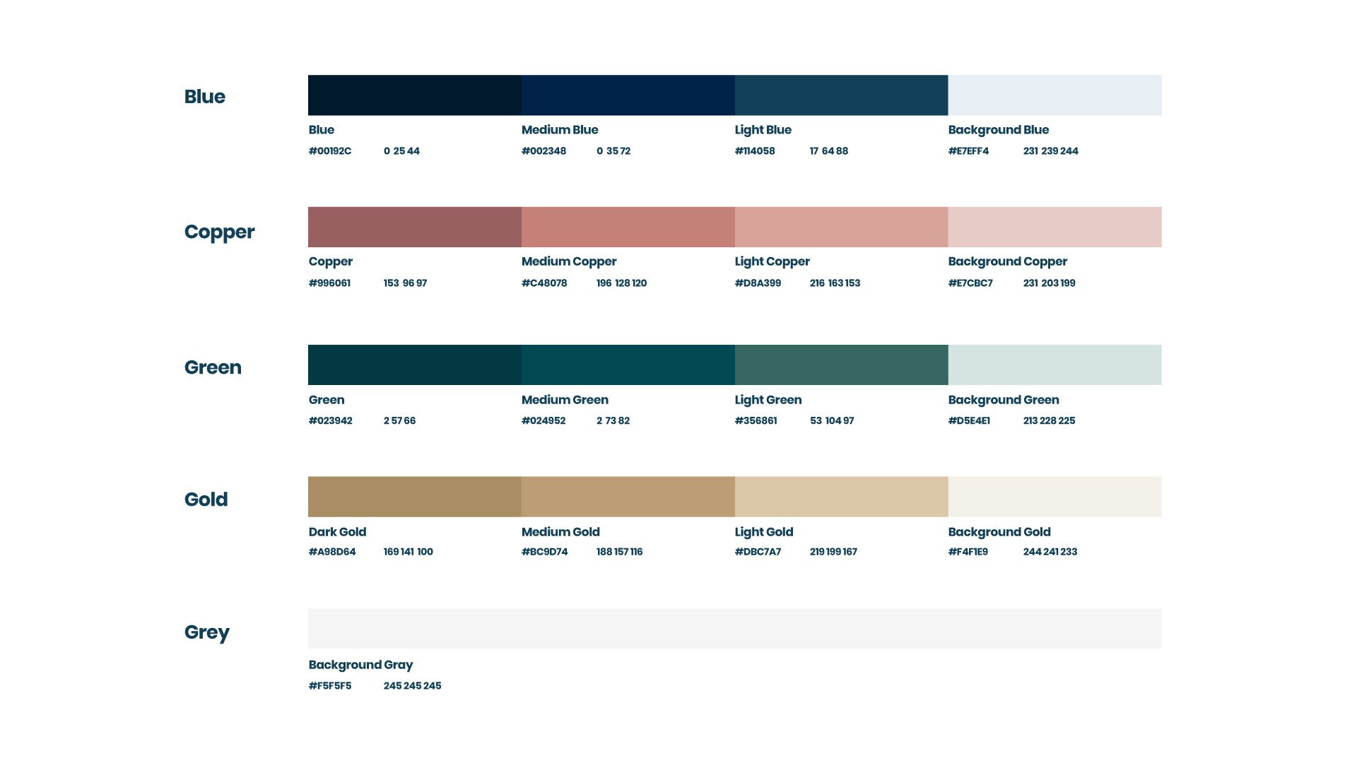

To maintain consistency across all branding materials, a comprehensive style guide was developed. This guide featured an updated color palette inspired by natural, grounded hues that resonate with the brand’s identity. It also included thoughtfully chosen typography that emphasizes both readability and professionalism. Additionally, clear guidelines on logo usage, spacing, and alignment were established to preserve brand integrity and ensure consistent presentation.
Photography Direction

To bring the brand’s personality to life, I collaborated with Canadian photographer Christina Louise Branding, by providing clear art direction to ensure the visuals aligned with Take Roots Consulting's clean, professional aesthetic. This included guidance on composition, lighting, and overall tone to produce images that seamlessly integrated into the website and social media platforms. The resulting visuals not only enhanced the storytelling aspect of the brand but also created a cohesive and polished presence across all digital channels.


Reimagining the website experience

The website takeroots.ca was designed to be intuitive and visually engaging, with the following key features:
A clean, responsive layout optimized for desktop and mobile devices.
Strategic use of photography and visuals to convey the brand story.
Clear navigation to guide users seamlessly through the services offered.
Integration of contact forms to encourage client engagement.