Contrast: The Secret Weapon for Effective Marketing
The Matchmaker by Gerrit Van Honthorst
Painted in 1625 during the Dutch Golden Age, depicts a lively scene in a dimly lit tavern, where a young man and woman engage in flirtation under the watchful eye of an old matchmaker.
The word Contrast.
A word that asks you to think. It asks for you to look at two or more things and notice what is different. It is human nature for us to compare. We look for patterns. We look for change. It’s happening all around us and it’s hard not hard to compare. This ability has let us conquer our problems. To evolve.
Contrast by definition means “The state of being strikingly different from something else in juxtaposition or close association.” I want to focus on how we interact and use contrast in business and in our personal lives.
This is a short list of, what I think are great examples, across different mediums, that use contrast effectively to connect with their target audience.
The Tetons and Snake River by Ansel Adams
This 1942 photo in Grand Teton National Park, Wyoming captures the rugged beauty of the Teton Range with the Snake River winding in the foreground, leading the viewer’s eye toward the majestic mountains all through the power of contrast.
Photography
First, which I feel is THE FIRST thing that comes to mind when talking about contrast. It is a still image. A simple photograph. It lets everyone experience that exact moment. At any time. It will never change. Only us. This frozen moment with high contrast can make us cry. It can make us wonder.
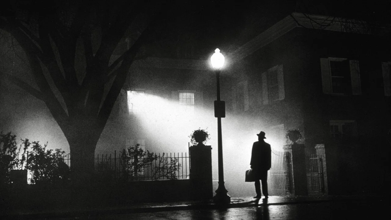
The Excorcist by William Friedkin
The Exorcist came out in 1973 and is not only an iconic film, but it is a great example of using high contrast to tell an effective story.
Film
Some of the most memorable, most striking, emotional, and unforgettable moments in film relied on contrast. A point had to be made. Maybe it’s the end of the “hero’s journey” like Luke in Star Wars. Or is it the end of Anakin’s journey? Or both? This contrast makes you think. When you remember key moments of a film you’ve watched, those major plot points, you remember them fairly specific. That’s because the director wanted you to see what was going on. With contrast, they can hand hold your attention, for a brief moment. Some movies, like 300 and Sin City, used high contrast the whole time. This creative direction gave these movies a unique look and helped stand out in advertising efforts.
McDonalds Logo
You’ll never look at fast food logos the same.
Advertisements
The advertisement world is a machine. With over 7 billion people on this planet, there’s a lot of shit to sell. Now that we’ve reviewed the concept of contrast in the form of static imagery and in motion, what happens when you use it as a sales tool? Ever drive down the road see those big red and yellow logos? The sky is probably blue, or black, or white. Maybe you see some trees. Maybe buildings and power lines. Those logos were designed with all that in mind and they know that when your’d driving down the road, hungry, seeing nothing but grays, browns, blue and greens, their brand colors will pop out and offer a cure for a very common human ailment. Hunger. Same thing happens in our social feeds. We see it everywhere, and the good ones are simple. Apple commercials simply nail this. And I’m not even talking about the literal commercials where Apple is comparing itself with PCs against a plain white background. I’m talking about those fast paced ones. You can dance while listening to your iPod. Catchy music. Dancing silhouettes contrasted against bright colored backgrounds. Quick. Simple. Or the newer AirPod Pro ad that uses control to show the different wolds you can be in. The normal, fairly low contrast of the real world. And the vibrant, high contrast world of music and dance.
Richer Solutions by Brandon Wilson Creative
Don’t be boring! And what better way to say that on top of the words, is to use contrast in your design. Here we see Richard’s tagline front and center, using large, bold, dark letters on a light background. richersolutions.com/
Websites
The new kid on the block. Comparatively. If we take all that we just talked about it, and added that knowledge making a website, we’d be doing everyone a favor. A website is a marketing tool. It is this place that offers customers and prospects an opportunity to engage with your business on their time. The internet broke down many walls when it arrived and following shortly after it was the world of social media. Many people and businesses raced to the web and find their way through a digital Wild West. We’ve come a long way since then. We have User Experience (UX) and User Interface (UI) Designers who literally work off the entire concept of what contrast is and how it can help guide users to interact and understand something.
Thank you for reading. I hope this article helped you to not only have a better understanding of what contrast is, but how it can be used as a tool within your marketing plan.


